
Guide · 16 November 2026 · 5 min read
Website accessibility small business: the basics
Website accessibility small business means making your site easier to use for everyone, including people who rely on screen readers, keyboard navigation, or higher contrast. It is not a niche extra. It starts with three practical checks: readable colour contrast, useful alt text, and a site that works without a mouse. If you get those right, you improve the experience for customers and make your content easier to maintain too.
What website accessibility means in practice
For a small business, accessibility is mostly about removing barriers. A customer should be able to read your text, understand your images, open your forms, and move around your pages without getting stuck. The W3C Web Content Accessibility Guidelines set the standard most teams use, and they are a sensible reference even if you are not aiming for a formal audit.
We see the same problems again and again when we build websites: faint text on pale backgrounds, buttons with unclear labels, image galleries with missing descriptions, and navigation that only works with a mouse. If you want a done-for-you site that bakes in the basics from day one, our Your Website, Done For You package is the simplest route.
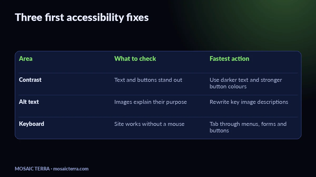
Website accessibility small business: the three checks to fix first
| Check | What good looks like | Why it matters |
|---|---|---|
| Contrast | Text and buttons stand out clearly from the background | People can read your site in bright light, on phones, and with low vision |
| Alt text | Images have short descriptions that explain the purpose | Screen reader users can understand what the image adds |
| Keyboard | Menus, forms and pop-ups can be used without a mouse | People who cannot use a mouse can still book, buy or enquire |
1) Contrast
Do not rely on colour alone to carry meaning. A pale grey paragraph on a white background may look stylish, but it can be hard to read. The WCAG contrast guidance explains that text needs enough contrast to remain legible for many users. In practice, choose darker body text, avoid light button text on pale fills, and test key pages on a phone outdoors.
2) Alt text
Alt text is not a place for keyword stuffing. It should say what the image is for. If an image shows your shopfront, write something like “Front entrance of our salon with step-free access” if that detail helps the customer. If the image is purely decorative, it may not need meaningful alt text. The ICO’s online guidance is useful context for how websites should handle personal data and user experience together, especially if your forms and trackers are involved.
3) Keyboard navigation
Try your own site with the mouse set aside. Can you reach the menu, open dropdowns, move through fields, and submit a form using the Tab key? If not, keyboard users may be blocked. That often happens when buttons are built badly, focus states are removed, or pop-ups trap the user. Google’s accessibility resources at web.dev/learn/accessibility are a good practical reference for fixing these patterns.
A simple fix order for busy owners
- Check the homepage first. Fix contrast, headings, and the main call-to-action.
- Review your key service pages. Make sure images have useful alt text and forms are easy to complete.
- Test with only a keyboard. Move through menus, buttons and booking forms.
- Check your PDFs and downloads. If they are public, they should also be readable and labelled properly.
- Repeat after edits. Accessibility can slip when new sections are added.
If you are also updating your site structure, our service page examples that turn visitors into enquiries guide and website speed check guide can help you tidy the rest of the user journey at the same time.
Common mistakes we see on small business sites
One common mistake is assuming accessibility is only about screen readers. It is broader than that. Another is using tiny text or placing essential information inside images, which makes it harder to read and harder to edit later. We also see websites where the contact form looks fine but fails when someone tabs through it. If that sounds familiar, it may be time to get a proper rebuild or a clean-up quote through our quote page.
Another easy win is making sure your content is written plainly. Short sentences, clear labels, and obvious buttons help everyone. If you like doing your own edits, the right layout can save a lot of time. Our Etsy shop also has useful ready-made digital tools for organised business owners: mosaicterra.etsy.com.
When to get help
If your site has booking forms, product pages, or a lot of old content, fixing accessibility one page at a time can take longer than expected. That is when a structured rebuild makes sense. We build small business websites that are clearer, faster to edit and easier for customers to use. If you want us to handle it, start with Your Website, Done For You or browse the full offers page.
A good accessibility fix is often simple: clearer contrast, honest alt text, and a site you can move through without a mouse.
Quick checklist before you publish
- Body text is easy to read on mobile.
- Buttons and links have clear labels.
- Important images have useful alt text.
- Menus and forms work with the keyboard.
- Contact details and opening hours are easy to find.
If you want a more complete website refresh, the fastest option is often a small rebuild rather than endless patching. That keeps your content tidy and makes future updates easier.
Prefer it done for you?
Websites from £449 one-off, an AI Receptionist for £49/month, AI agents from £89/month, or your complete AI world from £899.
Frequently asked questions
What is website accessibility for a small business?
It means making your site easier to read, navigate and use for more people, including keyboard and screen reader users.
Do I need to follow WCAG?
WCAG is the main accessibility standard many teams use as a benchmark. It is a sensible guide for small business websites too.
What is the easiest accessibility fix?
Start with better contrast, clear button labels, and useful alt text on important images.
Can I test accessibility myself?
Yes. Try your site on a phone, zoom the page, and use only the keyboard to move around forms and menus.
Sources
- W3C Web Content Accessibility Guidelines (WCAG)
- WCAG contrast minimum
- web.dev accessibility learning guide
Prices on this page are Mosaic Terra's own prices in GBP. Third-party information was checked on 16 November 2026; always confirm current details on the official pages.